
Adding a Feature to Craftsy App
Improving the Craftsy’s platform with intuitive content-saving and retrieval features, focused on enhancing user experience for hobbyists and creators.
Sector: Education, Design, Skill Development
My Role: UX/UI Design

My Role: I was the sole designer acting as an end-to-end UX/UI designer, completing all steps of the project.

PROJECT KICKOFF: SETTING THE STAGE
MAIN PROBLEM
Users experienced difficulties in organizing, saving, and retrieving preferred learning content on Craftsy's desktop platform. The lack of key features such as "like," "save playlist," and "search history" led to disrupted user experiences and hindered content accessibility and management.
TARGET USERS
Hobbyists and creators who use online courses to learn a skill.
IMPORTANCE OF THE NEW SOLUTION
Users rely on easy access to resources and inspiration. Difficulties in saving and finding content can lead to frustration and decreased engagement.
IMPACT OF THE NEW SOLUTION
The solution provides a seamless process for saving content. It enhances search functionality for retrieving saved content, and allows users to spend more time engaging with content rather than navigating the platform.
UNCOVERING INSIGHTS: THE RESEARCH PHASE
RESEARCH OVERVIEW
To define the problem and audience for the Craftsy redesign, we conducted both competitive analysis and usability testing. These methods helped gather qualitative insights into how users interact with the platform and identified areas for improvement.
COMPETITOR ANALYSIS
I began with a detailed competititor analysis comparing Craftsy to similar platforms such as Domestika, Skillshare, and YouTube. This allowed me to pinpoint missing features in Craftsy's desktop platform that its competitors offered, such as the ability to save playlists, view search history, and sync content across devices. The analysis revealed that Craftsy lagged in several key areas, particularly in terms of content organization and cross-device accessibility.


KEY TAKEAWAYS
Competitors like YouTube and Skillshare offer better features for saving and organizing content.
Cross-device syncing is a standard feature on competitive platforms, whereas Craftsy lacks this functionality.
USER INTERVIEWS AND USABILITY TESTING
I conducted remote usability testing sessions with five participants from diverse backgrounds, including a sales professional, student, UX designer, project manager, and retail worker. The focus was on understanding how users navigate Craftsy's desktop platform and their pain points.
Interview Questions:
How do you typically use Craftsy to find content?
What is your experience with saving videos or creating playlists?
How important is it for you to like or save content for future reference?
Do you use both desktop and mobile platforms for Craftsy? How seamless is your experience across devices?
Methods:
Tasks: Participants were asked to log in, explore content, and test features like liking videos, saving playlists, and viewing search history.
Think-Aloud: Participants vocalized their thoughts during the process, which helped us identify navigation challenges.
SURVEY AND RESPONSE RATE
Though no formal surveys were used, I relied heavily on real-time feedback during usability testing. All five participants completed the tasks and shared their experiences with using the Craftsy platform.
RESEARCH INSIGHTS
The chart illustrates the key features identified during user testing:
100% of participants emphasized the importance of "Like" and "Save" features and playlist creation for easier content management.
80% of participants wanted a "Recently Watched" section to enhance continuity and reduce disruptions in their learning process.
40% of participants highlighted the need for cross-platform sync for seamless access across devices.

INSIGHTS THAT PAVED THE WAY
One participant compared Craftsy’s lack of organization features to Apple iTunes, noting that "Apple lets me create playlists without restrictions; Craftsy should do the same." This comparison inspired me to rethink how I could streamline Craftsy's video-saving functionalities. Additionally, users frequently referenced YouTube’s ability to create playlists and resume videos, emphasizing the need for Craftsy to adopt similar features to keep up with user expectations in content accessibility and organization.
CONCLUSION
The combination of competitive analysis, interviews, and usability testing provided me with key insights into Craftsy’s user experience. The primary pain points revolved around the absence of a "like" feature, playlist creation, and the lack of search history. These insights are essential to improving Craftsy's platform, particularly to ensure cross-device synchronization and enhance content accessibility for users.
DEFINING THE CHALLENGE: CRAFTING USER-CENTRIC GOALS
Process description (start to completion)
INTRODUCTION TO THE PROJECT
The goal of the Craftsy project was to enhance user experience by introducing two new features: the ability to save content and search for saved content. This was a client project aimed at making the platform more user-friendly and accessible for users seeking to revisit their favorite content. The usability testing phase focused on evaluating these features’ effectiveness and identifying any usability issues users encountered.
RESEARCH PHASE
To understand the problem, I performed user research that included usability testing with five participants representing a diverse demographic. I gathered insights on user interactions through direct observation, noting how easily participants could save and retrieve content. Additionally, feedback was collected on user satisfaction and any challenges faced during the process. This research helped define users' needs and identify areas for improvement.
IDEATION AND DESIGN PHASE
Moving from research to ideation, I created low-fidelity wireframes to outline the layout of the new features. These wireframes were then developed into high-fidelity mockups using Figma. I included interactive prototypes to visualize the user flow of saving and retrieving content. Brainstorming sessions helped refine the designs, focusing on clarity and intuitiveness to align with user expectations.
TESTING PHASE
I conducted usability testing with participants to evaluate the designs. Feedback was gathered on the ease of saving and retrieving content. This testing provided insights into usability issues and informed necessary design adjustments. The insights highlighted specific areas for improvement, such as navigation pathways and feature discoverability.
IMPLEMENTATION/FINALIZATION PHASE
Based on feedback from usability testing, I iterated on the design, refining the user interface and addressing usability issues. The final deliverables included an interactive prototype and detailed mockups that were presented to the client. I ensured that all features were functional and that the user flow was intuitive before finalizing the project.
APPROACH
I took an iterative approach throughout the project. While I followed a structured process from research to design and testing, I frequently looped back to make adjustments based on user feedback. This involved revisiting wireframes and prototypes after usability testing to refine the user experience and enhance the effectiveness of the newly implemented features.
PERSONAS
During the project, I produced several key artifacts:

Persona 1: Amelia, 22 years old, an art and design student who uses learning platforms to acquire new skills and knowledge in art/design to enhance her career prospects once she graduates
Goals: Save tutorials for later use, easily retrieve saved content.
Pain Points: Frustration when unable to locate saved content quickly.
Motivations: Values user-friendly features that enhance her learning experience.

Persona 2: Donald, a 48 years old a software developer, is a tech enthusiast and a lifelong learner. He uses learning platforms to stay updated on the latest programming languages, tools, and industry best practices.
Goals: Bookmark recipes and classes for future reference.
Pain Points: Confusion about how to navigate to saved content.
Motivations: Wants a seamless experience to enhance his cooking skills without interruptions.
WHY THESE PERSONAS
These personas were chosen based on usability testing participants and their representative needs. They informed design decisions by highlighting the importance of intuitive navigation and clear pathways to access saved content.
Affinity Map
Desired Features Summary
The participants expressed a desire for the following features to enhance their learning experience:
Content Organization: Users want to easily mark, collect, and organize favorite content, similar to YouTube.
“I want to mark and collect my favorite content.”
Access and Continuity: Participants want to quickly access previously searched content, continue learning from where they left off, and have seamless transitions between devices (phone and desktop).
“It's frustrating to lose track of videos I've watched. I want to pick up where I left off.”
“I don't want my learning journey disrupted when transitioning between my phone and desktop.”
Personalization: Features like automatic recommendations based on preferences and personalized experiences were highly valued.
“I want automatic recommendations based on my preferences.”
“I want to personalize my experience based on my interests.”
Control: Users also want control over the visibility of their content.
“I want to control the visibility of my favorite content.”

Primary User Flows
Save Content
Retrieve Saved Content
FINAL ASSETS
Screenshots of low and high-fidelity wireframes, as well as the final visual designs, will be included. These will capture key design decisions and demonstrate user flows. If necessary, simplified versions of the assets will be created to condense information while retaining clarity.
FROM CONCEPT TO DESIGN
SKETCHES TO LOW-FIDELITY
I created wireframes to define the basic structure of the save and retrieve content features, allowing for quick feedback from participants before moving into detailed design.
HIGH-FIDELITY DESIGNS
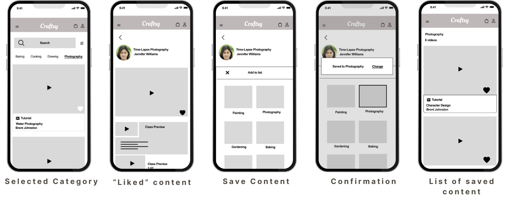
After refining the user flows, I translated the low-fidelity wireframes into high-fidelity designs, adding color, typography, and interactive elements to closely match the final product experience. Below you will see screens for “favorite content”, “save content to a list”, “saved content”, and “history/playlist”.

Inspiration for “like and save” design (Domestika), “playlist” and “watch history” design (Youtube)
Personal Reflection: My Favorite Part of the Design Process
Refining the UI: A Personal Reflection
One of the most enjoyable parts of the Craftsy project was the process of refining the user interface. As someone who frequently uses the Craftsy platform for my personal projects, it was exciting to take on the role of problem-solver for a tool I regularly interact with. Knowing the ins and outs of the site from a user's perspective allowed me to empathize with other users and anticipate their needs.
The challenge of improving the content-saving and retrieval features made the project especially fulfilling. I got to enhance a platform I love by making it more intuitive and user-friendly. Every design decision, from fine-tuning the visual layout to improving the functionality, felt impactful because I knew it would make a difference for other hobbyists like myself. It was both fun and rewarding to work on a real-world problem for a platform I genuinely enjoy using.
Validating My Vision: The Testing Phase
Usability Testing & User Interviews
Purpose
The usability sessions gathered insights on user interactions with Craftsy's desktop platform, focusing on evaluating new features ("save playlist," "like," and "search history") to improve satisfaction and align desktop and mobile experiences. Testing was conducted in-person and via Zoom.
Testing Methods
Participants completed five tasks: logging in, exploring content, liking content, saving playlists, and viewing search history, while thinking aloud to share real-time feedback.
Participants
The participants represented a variety of demographics:
P1: Male, 48, sales professional
P2: Female, 22, student
P3: Female, 38, UX designer
P4: Female, 39, project manager
P5: Female, 37, retail worker
Findings & Feedback
Like and Save Features: 100% of participants stressed the importance of these features for content retrieval. P3 noted, "Without these, it’s hard to find what I love," while P2 emphasized ease of use.
Search History: 80% expressed disappointment with the lack of a search history feature, with P4 suggesting a "recently watched" section to resume content quickly.
Cross-Platform Sync: 40% highlighted the need for synchronization between desktop and mobile, with P4 saying, "It would make switching between devices seamless."
Privacy Concerns: 20% of participants wanted control over the visibility of liked content, especially for personal preferences.
Design Decisions
Feedback led to the following key decisions:
Implemented "Like" and "Save Playlist" features to ensure easy content retrieval.
Added a search history and "recently watched" category to improve user convenience.
Prioritized cross-platform sync for seamless transitions between devices.
Included privacy controls for users to manage the visibility of their liked content.
WIREFRAME AND TESTING
I conducted usability testing on both low-fidelity (low-fi) and high-fidelity (high-fi) wireframes to gather feedback at different development stages:
Low-Fidelity Testing:
Focused on structure and functionality, low-fi wireframes were tested early to:
Evaluate user flow and layout.
Identify usability issues in navigation and task completion.
Test content-saving and retrieval processes without visual distractions.
High-Fidelity Testing:
Refined high-fi wireframes included polished designs with colors, typography, and detailed UI elements. Testing focused on:
Assessing visual design alignment with user expectations.
Evaluating detailed elements like button placement and interactions.
Ensuring the interface was both appealing and intuitive.
This dual approach ensured the design was effective structurally and visually before development.
PROTOTYPE TESTING
To validate the design decisions and ensure the user experience aligned with user needs, I created an interactive prototype in Figma. This prototype simulated user flows and allowed participants to interact with specific features, enabling me to test functionality and usability before final development. The prototype was used to evaluate how users interacted with two key features: saving content and searching for saved content.

Design Impact
The feedback received from this prototype testing directly shaped design revisions. Based on user input, I focused on improving the visibility of saved content, enhancing the search feature, and ensuring a more intuitive navigation flow. I also considered adding cross-platform sync functionality in future iterations.
Interact with the prototype to search for content on photography, save your favorite content, and then retrieve it for later playback.
Insights from Testing and Impact on Final Deliverables
User testing provided crucial insights that shaped the final design of the Craftsy platform. Key findings from testing influenced several improvements:
“Like” and “Save” Features: Users struggled to track their favorite content, prompting the addition of “Like” and “Save Playlist” features, making them prominent and easy to use.
Search History: Participants wanted a “Recently Watched” section, which was implemented in the final design to enhance content accessibility.
Navigation: Difficulty in finding saved content led to redesigning the “My Content” section for clearer navigation.
Cross-Platform Sync: Feedback highlighted the need for syncing across mobile and desktop, shaping future development plans.
These insights ensured the final deliverables offered improved navigation, search and playlist features, and a user-centered design roadmap for cross-platform functionality.
Conclusion
Final Thoughts: Insights and Future Directions
This project highlighted the importance of designing intuitive, user-friendly features for saving and retrieving content on Craftsy. Addressing challenges like navigation and cross-platform syncing, I focused on usability improvements driven by user feedback.
I excel at problem-solving through user-centered design, iterating based on real-world insights, and refining features like advanced search and device syncing. I’m proud of creating solutions that genuinely enhance the user experience.