
Pleasant Hill Baptist Church: Responsive Web Design
Enhancing Community Engagement Through an Intuitive and Accessible Online Experience
Sector: Non-profit and Community
My Role: UX/UI Design

My Role: was the sole designer acting as an end-to-end UX/UI designer, completing all steps of the project.
Problem: The primary challenge was modernizing Pleasant Hill Baptist Church’s website to better serve the congregation, improving accessibility, engagement, and usability.
Audience: The website was designed for church members, new visitors, and community members who want to connect with the church online.
Necessity: The previous site was outdated and difficult to navigate, particularly on mobile devices. A responsive redesign was essential to ensure a positive user experience for everyone.
Solution Benefits: A responsive design would allow users to easily access information about services, events, and resources from any device, strengthening community engagement.
RESEARCH
User Interviews and Surveys
To gain an understanding of both church members and potential newcomers, I conducted interviews and distributed a survey to gather specific feedback.
Interviews: Five participants were interviewed, offering perspectives from long-standing church members, recent attendees, and non-members. Key interview questions included:
“What information do you most often look for on the church website?”
“How would you prefer to interact with church events and resources online?”
Participant Profiles:
P1: Long-term member (25 years) who values the transition from in-person to virtual services.
P2: Mid-career member (5 years) seeking modern design and user-friendliness.
P3: Newer member who joined during challenging times, emphasizing the church’s role as a source of comfort.
P4 and P5: Non-members who represent potential newcomers, focused on community engagement and a welcoming online presence.
Surveys: A survey revealed that over 70% of users accessed the website on mobile, indicating the necessity for a responsive design.
Competitor Analysis
To gauge Pleasant Hill’s digital experience against similar churches, I conducted a competitive analysis, focusing on essential web design criteria across local church websites.

Key Insights:
Navigation & Accessibility: Users wanted simpler, mobile-friendly navigation to locate service times, events, and other resources.
Community Connection: Both members and newcomers desired interactive elements, such as an event calendar, live stream options, and volunteer sign-ups.
Engagement & Feedback: Members lacked a dedicated platform for feedback and communication on the website, underscoring the need for tools like discussion forums, prayer requests, and feedback submission options.
Pain Points:
Limited feedback options for members to share their thoughts, submit requests, or report concerns.
Current website accessibility issues, particularly on mobile design.
Define
The goal of the project was to redesign Pleasant Hill Baptist Church’s website to address declining attendance and donations post-COVID, making it more engaging, user-friendly, and better aligned with the needs of both current and potential members. The aim was to provide an online space that reflects the church's community values, facilitates spiritual growth, and fosters connection.
Research
I began with user research, using empathy and affinity mapping to capture participant needs and insights. We conducted interviews and surveys to gather feedback on users’ church attendance experiences, website usage, and engagement with online church activities.
Analysis
Through empathy and affinity mapping, we identified participants’ desires for spiritual fulfillment, community, and clear, transparent communication about safety and beliefs. This helped us build personas that guided our design.
Ideation and Design
We created a sitemap, user flows, and wireframes, followed by usability testing and feedback loops to refine the design iteratively. We compared with competitor websites to integrate best practices in engagement and interactivity.
Test
Usability testing on the new design helped fine-tune the user experience, ensuring it met the community's needs for information accessibility, interaction, and connection.
DELIVERABLES
The goal of the project was to redesign Pleasant Hill Baptist Church’s website to address declining attendance and donations post-COVID, making it more engaging, user-friendly, and better aligned with the needs of both current and potential members. The aim was to provide an online space that reflects the church's community values, facilitates spiritual growth, and fosters connection.
Empathy Map
Visualizations of user thoughts, feelings, actions, and needs.

Personas


Maria (The Nurturer) – A long-time member who prioritizes accessibility to events and ministry information, desiring deeper engagement and more interactive online resources.
David (The Seeker) – A non-member looking for a community and spiritual connection, values transparency, safety, and opportunities for involvement.
Site Map
The sitemap organized the website into easily navigable sections, such as:
Home: Highlighting the church’s mission, values, and links to key areas.
Events Calendar: Interactive calendar for upcoming events.
Ministries and Programs: Showcasing various church groups and activities.
Online Giving: For convenient, secure donations.
Community and Outreach: Featuring connection opportunities and volunteer work.
User Flows
The user flows guided users like David and Maria through accessing information about the church, engaging with community events, and making online donations. For example:
David’s Flow: Finding the church’s beliefs and safety practices, exploring service opportunities, and signing up for events.
Maria’s Flow: Accessing the calendar for upcoming events, joining ministry groups, and exploring Bible studies or prayer requests.
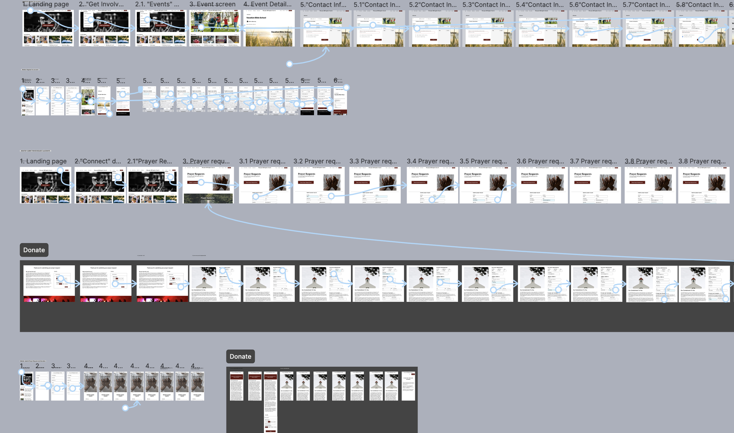
Sign up for an event
Submit a prayer request
DESIGN
"The design section details how I transformed key insights into a responsive, user-friendly interface, prioritizing accessibility and consistency across all screen sizes to enhance the overall user experience."
Low-Fidelity Wireframes


TEST
The test stage involved gathering user insights to verify the design’s usability and make targeted improvements. This section covers the testing approach, critical findings, and refinements implemented to enhance the overall user experience.
Tasks Tested:
Event Signup
Participants explored the "Get Involved" tab, navigated to "Events," registered for Vacation Bible School, and submitted contact information.
Insights: 60% of desktop users encountered moderate difficulty with initial navigation, while locating specific events posed major issues for 20%.
Prayer Request
Participants found and filled out the "Prayer Request" form via the "Connect" tab.
Insights: Major issues in selecting a prayer request category were observed, and suggestions to clarify required form fields were noted.
Making a Donation
Participants accessed the donation page, selected donation amounts, and completed the submission.
Insights: No major issues were encountered, with an average completion time of under 15 seconds, suggesting smooth navigation and clarity.

Feedback for High-Fidelity Designs
Recommendations for accessibility improvements were applied to upcoming high-fidelity wireframes to better support user needs.
Clarity in CTAs and alternative event discovery are top priorities in the next design phase.
High-Fidelity Wireframes


Interact with the prototype to register for an event, submit a prayer request, and make a donation.
CONCLUSION
I designed a user-friendly, accessible experience with seamless responsiveness across devices. Key challenges included balancing performance with device-specific adjustments and ensuring design consistency. Through this project, I learned the importance of scalable design and early, multi-device testing. Moving forward, I’ll prioritize efficient, adaptable designs and refine animations and accessibility features. My proudest achievement was creating a responsive design that meets diverse user needs, reinforcing my commitment to user-centered, adaptable solutions.